
This book is a great reference for the complex psychological concepts behind the fundamentals of designing intuitive products and experiences.

Jakob's Law
Users spend most of their time on other sites, and they prefer your site to work the same way as all the other sites they already know.
Key Takeaways
- Users will transfer expectations they have built around one familiar product to another that appears similar
- Leveraging existing mental models would help us to create superior experiences that would flatten the learning curve of our service
- When introducing re-designs, prefer gradual transitions between the versions. Allow people to keep using the old version so they can try and adapt without completely leaving the product
Origins
Dates back to Jakob Nielsen's works in 2000. The less mental energy users have to spend learning an interface, the more they can dedicate to achieve their objectives.
Psychology Concept: Mental Models
A mental model is what we thing we know about a system, especially how it works. We also tend to apply the knowledge when interacting with similar types of systems.
Examples
- Form elements looking like real-world controls; toggles, radio inputs, buttons.
- All e-commerce sites look the same.
- Major redesign transition: YouTube allowed people to keep using the old UI for a while.
Technique: User Personas
Using personas would help us to frame design decisions based on the needs of the real audience.
Key Consideration: Sameness
This law might sound like it's enforcing all the websites look the same, which is a completely valid concern. However, we should keep in mind the form should follow function in order to deliver usable stuff. There's always room for innovation.
Conclusion
Always being with common patterns and conventions, and only depart from them when it makes sense to. If you can make a compelling argument for making something different to improve the core user experience, that's a good sign that it's worth exploring.
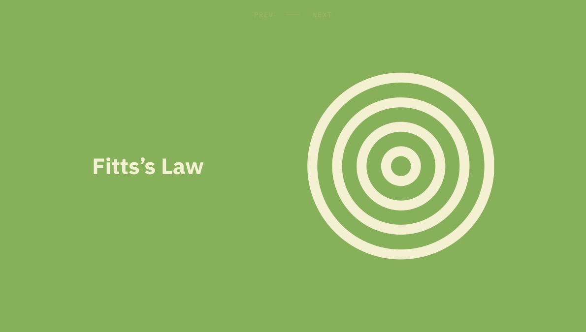
Fitts's Law
The time to acquire a target is a function of the distance to and size of the target.
Key Takeaways
- Touch targets should be large enough for users to accurately select them.
- Touch targets should have ample spacing between them.
- Touch targets should be placed in areas of an interface that allow them to be easily acquired.
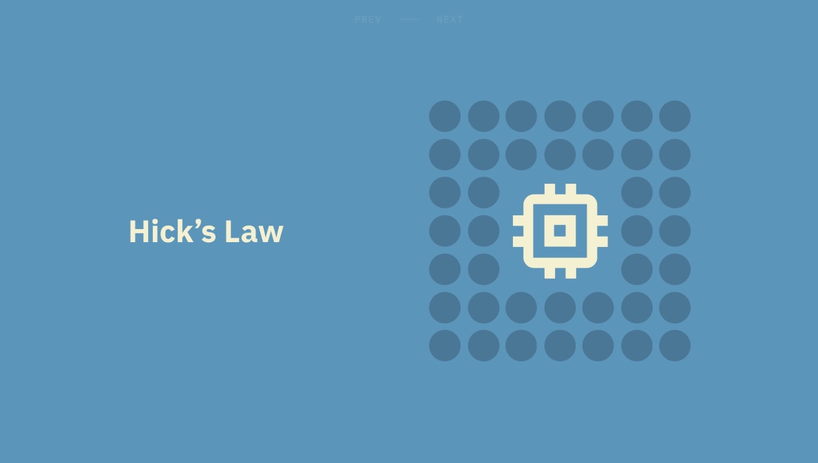
Hick's Law
The time it takes to make a decision increases with the number and complexity of choices available.
Key Takeaways
- Minimize choices when response times are critical to increase decision time
- Break complex tasks into smaller steps in order to decrease cognitive load
- Avoid overwhelming users by highlighting recommended options
- Use progressive onboarding to minimize cognitive load for new users
- Be careful not to oversimplify the point of abstraction
Origins
Psychology Concept: Cognitive Load
The amount of resources needed to understand and interact with an interface is known as cognitive load.
Examples
- TV remote controllers with a lot of irrelevant buttons, eventually replaced with simpler versions like Apple TV remote.
- Google search showing different types of search options (text, image, etc) after you initiate the search process. Conditionally complicating the UI, similar to filtering the file dropdown actions based on selected file type on Putio.
Technique: Card Sorting
Can be used to determine which elements are vital for the interface to achieve the expected task
Key Consideration: Oversimplification
Removing text labels and just leaving icons in order to simplify the interface (iOS bottom tab bar, Facebook example) may lead to confusion for some users.
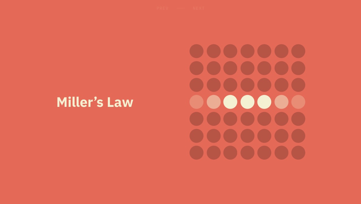
Miller's Law
The average person can keep only 7 (+-2) items in their working memory.
Key Takeaways
- Remember that short-term memory capacity will vary per individual, based on the prior knowledge
- Organize content into smaller chunks to help users process, understand and memorize easily
- Don't use the "magical number seven" to justify unnecessary design limitations
Origins
Cognitive psychologist George Miller's 1956 paper titled "The Magical Number Seven, Plus or Minus Two: Some Limits on Our Capacity for Processing Information". The research was just indicating the best performing item count in a chuck was around that number, however the conclusion of the research under-interpreted as The Magical Number Seven!, which was a rhetorical choice of words from the beginning.
Psychology Concept: Chunking
Miller found the size of the chunks (either letters or words) did not seem to matter, but the number of the items in chunks and the number of chunks did.
Examples
Phone number input formatting: 4408675309 —> (440) 867-5309
Key Consideration
Do not try to apply Miller's Law to components that don't need to be memorized by the user, such as navigation menus.
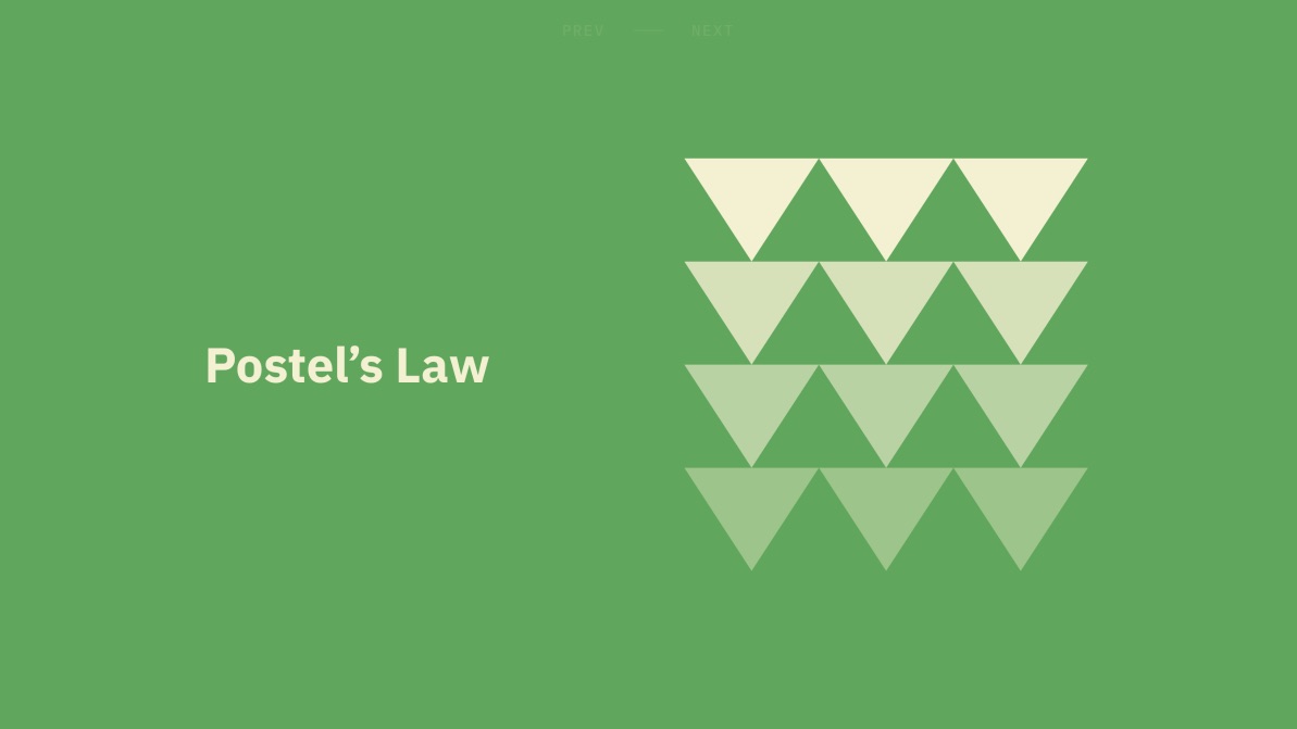
Postel's Law
Be conservative in what you do, be liberal in what you accept from others.
Key Takeaways
- Be flexible and tolerant for various actions user can take or inputs they might provide
- Anticipate anything in terms of input, access and capability
- Be clear while defining the boundaries of the input, and while giving the feedback for invalid ones
Origins
Also known as the robustness principle, based on the idea of a significant contributor of the TCP: John Postel. It's a guideline for the systems to follow while receiving and sending messages to the network they are in. The way web browsers parse and render HTML and CSS is also similar, they handle the syntax errors gracefully.
Examples
- When it comes to UI, this law applies mostly to the form inputs. Auto formatting text inputs, search input with dictation capability.
- Another good example is the application of biometrics in mobile devices.
- Also the responsive design, the UI tries to adapt any screen resolution.
Key Consideration: Design Resiliency
Postel's law comes with an opportunity to improve the accessibility, but it may also have some downsides like adjustable font sizes breaking the UI, translations in other languages breaks the positioning and etc.
Peak-End Rule
People judge an experience largely based on how they feld at its peak and at its end, rather than on the total sum or average of every moment of the experience.
Key Takeaways
- Pay close attention to the most intense points and the final moments of the user journey.
- Identify the moments when your product is most helpful, valuable, or entertaining and design to delight to end user.
- Remember that people recall negative experiences more vividly than positive ones.
Origins
Various control groups found the less painful (even though they are more long) experiences more pleasant. Colonoscopy and water temperature experiments.
Psychology Concept: Cognitive Biases
- Confirmation bias: impairs the confirmation of others
- Memory bias: impairs the recall of the memory
Examples
- Mailchimp congratulating the user with high-fiving gorilla after the very first e-mail campaign has been sent.
- Uber displaying the wait times with realistic explanation to the users.
Technique: Journey Mapping
Can be used to map out the user journey and pinpoint the peak and end steps.
Key Consideration: Negative Peaks
It is inevitable that something go wrong at some point in the lifespan of the journey. However, handling those errors gracefully and communicating them with the user in a sympathetic way (cute 404 messages) may decrease the negative impact.
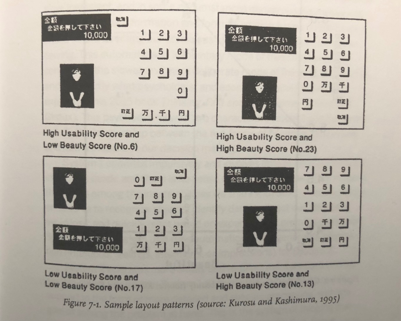
Aesthetic-Usability Effect
Users often perceive aesthetically pleasing design as more usable.
Key Takeaways
- An aesthetic design creates a positive response in people's brains and makes them think it's more usable
- People are more tolerant of minor usability issues when the design of a product is aesthetically pleasing
- Visually pleasing design can mask usability problems and prevent issues from being discovered during usability testing
Origins
Goes back to the user testing sessions done for the ATM interfaces in Japan.
Psychology Concept: Automatic Cognitive Processing
Contrary to what we have been taught not to do, people do in fact judge the books by their covers.
As discussed in the book Thinking Fast and Slow by Daniel Kahneman, our brain has two systems. The first one is used more effortlessly which carries over the intrinsic inheritance and gains. It makes quick scans for the objects, or the other stuff that we are interacting with, to decide they are worthy or not. This also applies to digital products, or services.
System 2 is used for more advanced tasks which require computation. It operates more slowly and requires mental effort to examine situations. Focus, research, memory retrievals and mathematical operations are some examples.
Examples
Products that are both aesthetic and usable.

Braun SK4, designed by Hans Gugelot and Dieter Rams.
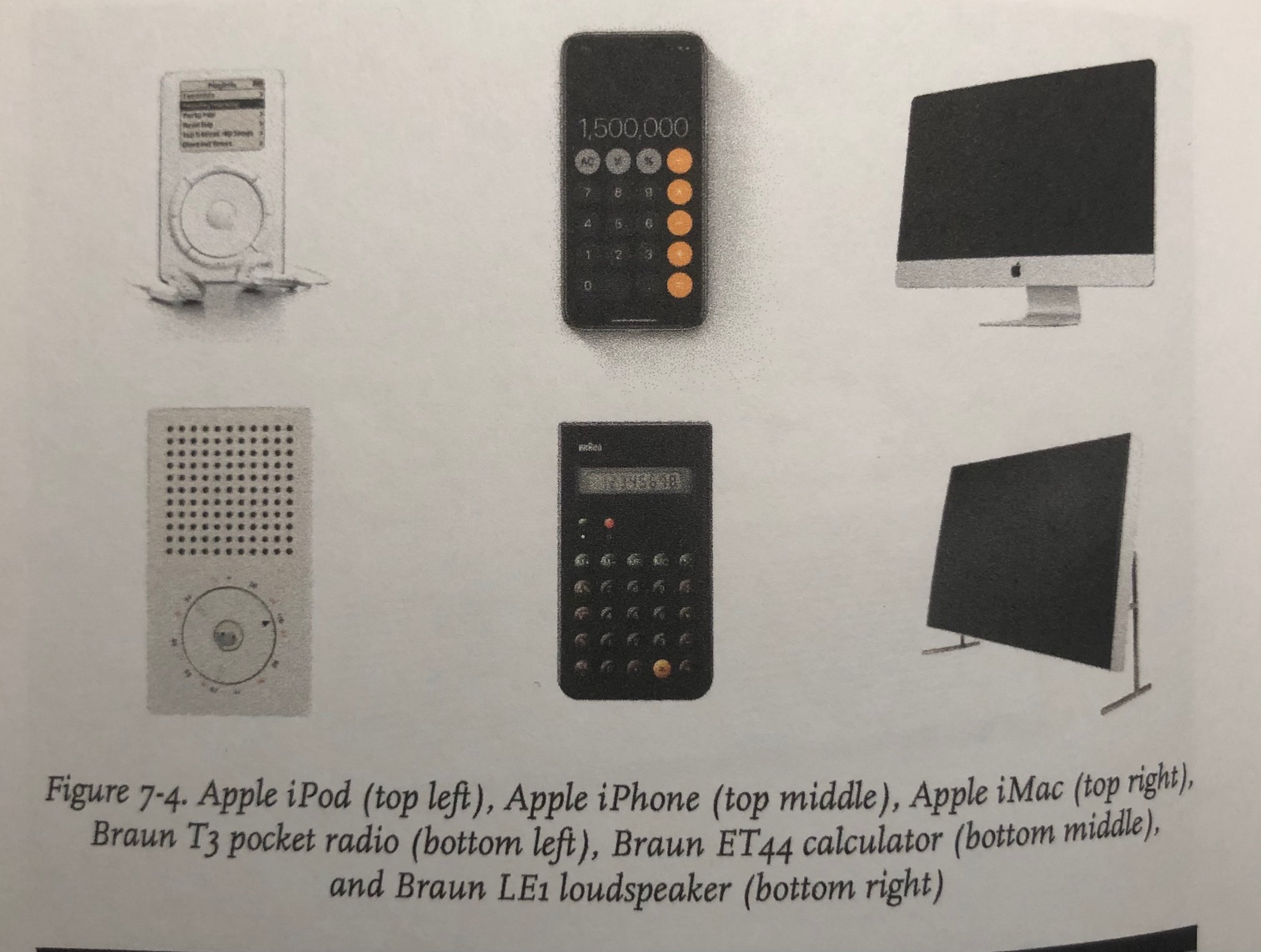
Apple's inspiration of the Braun products.
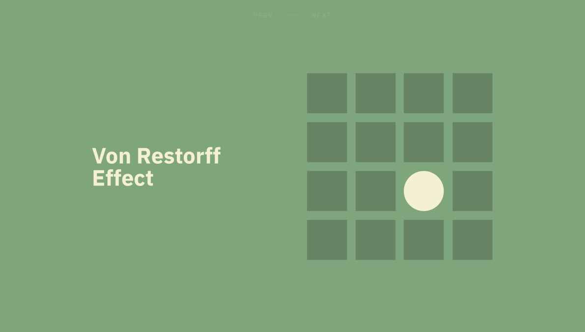
Von Restorff Effect
When multiple similar objects are present, the other one that differs from the rest is most likely to be remembered.
Key Takeaways
- Make important information or key actions visually distinctive.
- Use restraint while placing emphasis on visual elements to avoid them competing with one another and to ensure salient items don't get mistakenly identified as ads.
- Don't exclude those with a color deficiency or low vision by relying exclusively on color to communicate contrast.
- Carefully consider users with motion sensitivity when using motion to communicate contrast.
Origins
Dates back to the researches of German psychiatrist and pediatrician Hedwig von Restroff. It is a bit obvious: we best remember the distinctly different elements better.
Psychology Concept: Selective Attention, Banner Blindness, and Change Blindness
Attention is a limited resource, and we don't always realize the changes in front of us, unless they create a sense of attention.
Banner blindness: users think the content is an ad.
Change blindness: users don't realize the changes.
Examples
- Confirmation modals with red action buttons (delete modal)
- Material design FAB button for consistency for performing an action within any page
- Pricing list with featured elements, with colors, size and etc.
- App icon badges calling for attention
Key Consideration: Moderation and Accessibility
While designing for attention, we need to make sure the approaches taken won't create a noise in the interface, and they are accessible for people with disabilities.
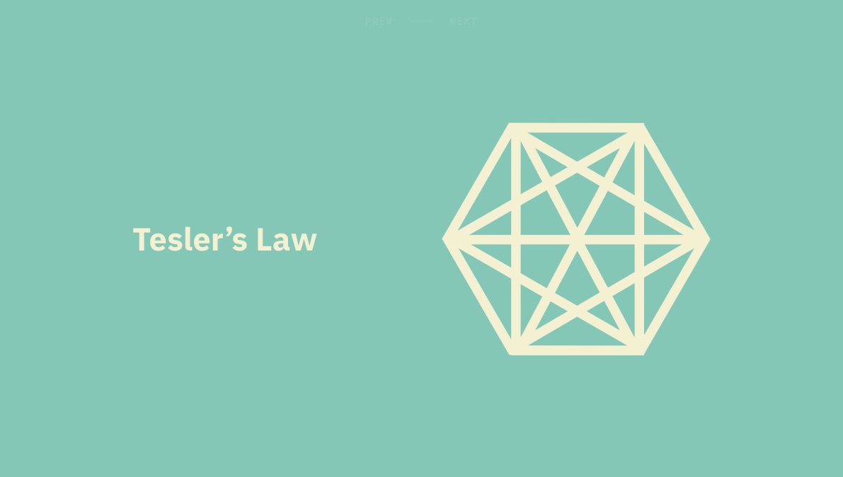
Tesler's Law
For any system, there is a certain amount of complexity that cannot be reduced.
Key Takeaways
- All processes have a core of complexity that cannot be designed away and therefore must be assumed by either the system or the user.
- Ensure as much as possible of the burden is lifted from users by dealing with inherent complexity during design and development.
- Take care not to simplify interfaces to the point of abstraction.
Origins
Dates back to the Xerox PARC days around mid-1980s. Lerry Tesler was a computer scientist working on the project, and his observed that the way users interact with a system is just as important as the system itself.
Examples
- Technically, an e-mail needs three ingredients: sender, recipient, and the message. The e-mail clients are reducing the complexity by autofilling the sender address for us. Although we still need to deal with the remaining two, products like Gmail (Smart Compose) are leveraging AI to help the user by suggesting recipients, auto-completion for messages, and even pre-written replies.
- Simplifying the checkout process with a checkbox to make the billing information as the same as shipping information.
- Amazon Go: in store shopping without cash registries.
Key Consideration: When Simplicity Turns to Abstraction
When an interface has been simplified to the point of abstraction, there is no longer enough information available for the users to make informed decisions.
Again, ambiguous icons without text labels. We still don't have a standardized mapping for the icons and actions. Presenting them without labels may lead to an abstraction.

Doherty Threshold
Productivity soars when a computer and its users interact at a pace (<400ms) that ensures that neither has to wait on the other.
Key Takeaways
- Provide system feedback within 400ms in order to keep users' attention.
- Use perceived performance to improve response time and reduce the perception of waiting.
- Animation is one way to visually engage people while loading or processing is happening in the background.
- Progress bards help make wait times tolerable, regardless of their accuracy.
- Purposefully adding a delay to a process can actually increase its perceived value and instill a sense of trust, even when the process itself actually takes much less time.
Overview
- 100ms response feels instantaneous.
- 100 - 300ms begins to be perceivable.
- If it extends 1000ms, people begin to think other things.
Origins
IBM paper published in 1982 states the productivity increases in a direct correlation with the response time.
Examples
- Skeleton screens reduce the impression of waiting, and they are also useful for UI to be predictable.
- Blur up technique for the images: Medium uses this to display a blurred version of the image till its fully loaded.
- Progress indicators: it's a bit weird but their presence is more impactful than the accuracy.
- Optimistic UI: Instagram example while posting a comment. The good thing here is it doesn't say "POSTED!" it immediately appends the written comment to the comment list but says "Posting" as the subtitle
Key Consideration: When Response Times are Too Fast
Fast response times can also cause several issues such as
- It is too fast to be perceivable, the feedback is missed.
- It is too fast and the user thinks there was a problem.
Purposefully adding a delay to process can actually increase its perceived value and instill a sense of trust, even when the process actually takes much less time.
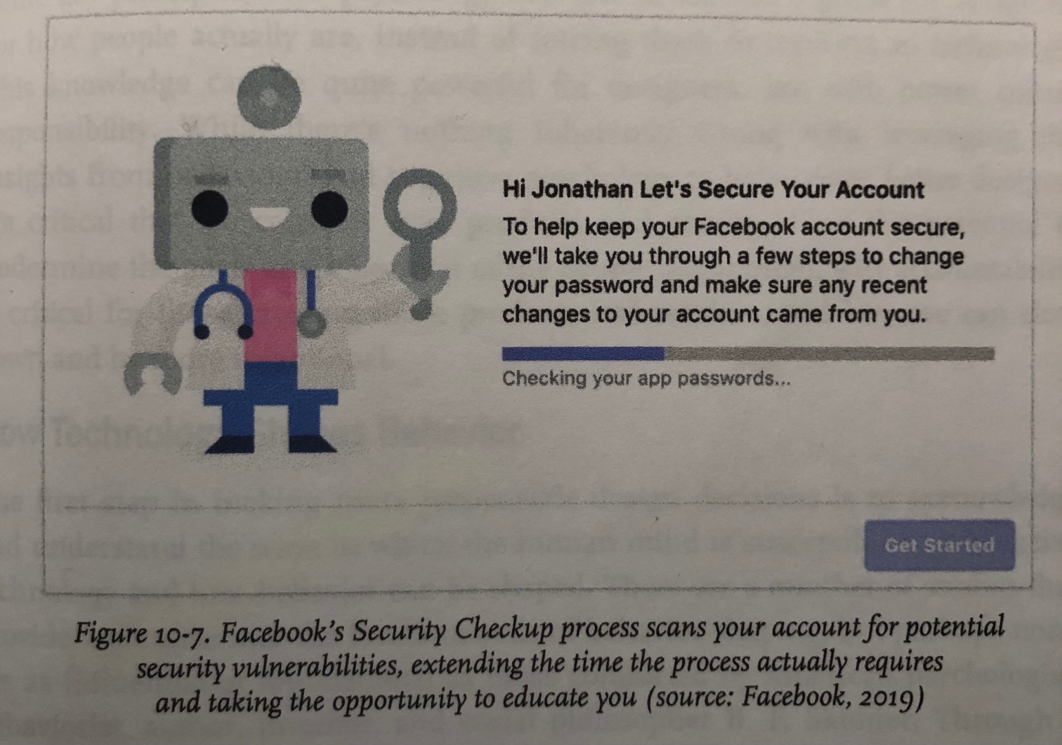
Facebook's Security Checkup process takes actually less time, but they prolong it to educate user.
With Power Comes Responsibility
Our responsibilities as designers, humane design, Skinner's Box...
The concepts we have seen in Hooked and Indistractable.
- Intermittent variable rewards.
- Infinite loops.
- Social affirmation (like, retweet, share)
- Reciprocity: LinkedIn creating a sense of obligation to endorse back by sending a notification people endorses you.
- Dark patterns: only left X in stock.
The Ethical Imperative
Use more meaningful metrics like helping people to achieve their goals rather than "daily active users" or "time spent on site".
Think Beyond the Happy Path
Placing the edge cases in our thinking would help us to ensure that we're creating more resilient products that considers the most vulnerable cases by default.
Look Beyond Data
Quantitative data tells us lots of useful things but emotions. It's critical to gather other metrics by communicating with the users in order to understand them better, and serve them better.
Applying Psychological Principles in Design
Obviously, designers who learn and master psychological principles would produce more anticipating products and services for the humanity. This section goes through how to increase awareness over the concepts discussed in this book, and how to internalize them to use in our works.
The most effective way to leverage psychology in the design process is to embed it into everyday decision making.
Building Awareness
By visibility: print-out the posters of each concept and put them into walls.
Show and tell: knowledge sharing sessions on new techniques, tools and findings over the recent events such as usability tests or a recently completed project.
Design Principles
Teams can create a consistent decision making within the design process by establishing a set of guidelines that represent the priorities and goals of a design team and serve as a foundation. Those principles would be used as the north star as the team produces more and more.
Defining the Principles
- Identify the team
- Align and define
- Diverge
- Converge
- Refine and apply
- Circulate and advocate
Best Practices
- Good design principles are not truisms
- Good design principles solve real questions
- Good design principles are opinioated
- Good design principles are memorable
Connecting Principles to Laws
Define the principle, connect it with one or more laws, set rules to support them which should be used by all the members while designing interfaces.
Principle: Clarity over abundance of choice.
Description: According to Hick's Law, we know that the time it takes to make a decision increases with the number and complexity of choices available.
Rules — To achieve this goal, we must:
- Limit choices to no more than 3 items at a time
- Provide brief explanations when useful that are clear and no more than 80 characters
Familiarity over novelty
According to Jacob's Law, we know that the users spend most of their time on other sides, and they prefer our site to work the same away as all the other sites they already know.
To achieve this goal, we must:
- Use common design patterns to reinforce familiarity with the interface
- Avoid distracting the user with a flashy UI or quirky animations